Definition
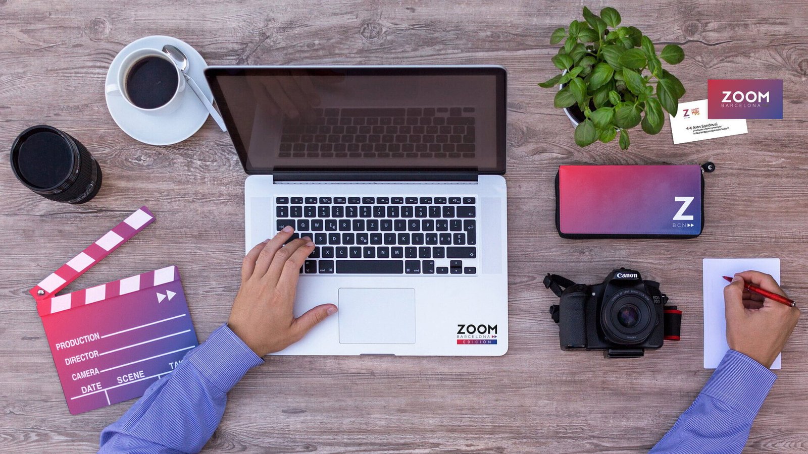
The challenge of Zoom Barcelona was to renovate their brand identity in order to connect both with their current audience and with potential clients. More than just a new logo, the company needed a visual strategy that reflected their evolution and the launch of their new shows, while maintaining coherence in all of their communications.
Project
From the 80’s to an accelerated world
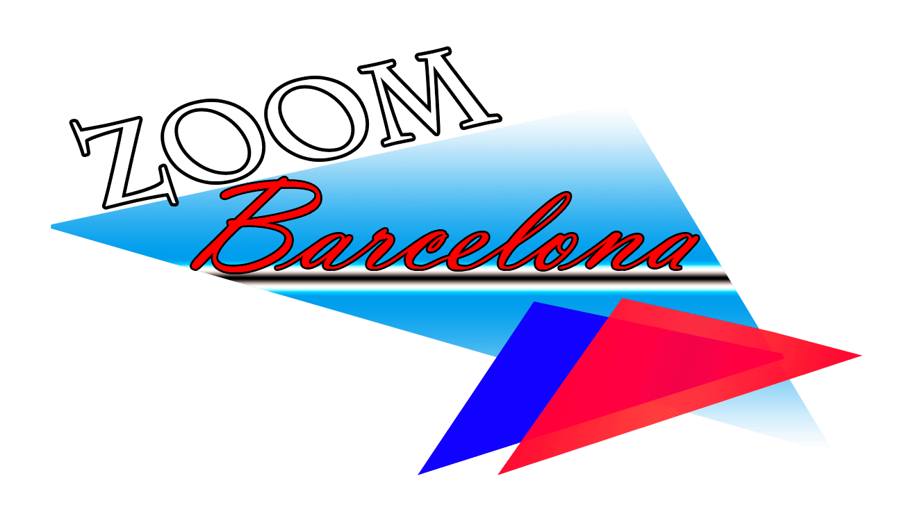
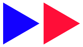
Zoom Barcelona’s original logo was inspired by the aesthetic of the 80s, with triangles and neon colors which evoked the pop culture of the time.
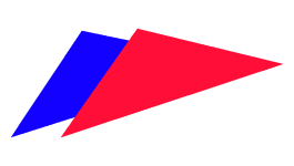
In the redesign, we maintained the iconic elements of the original logo, like the blue and red triangles, but we gave them a more subtle role. The objective was to posición the brand in a modern and relevant sector, avoiding the association with obsolete tendencies.
The triangles were reinterpreted as a “forward” icon, a perfect symbol for the age of accelerated digital content, where the audiovisual consumption has multiplied and the velocity “x2” is a norm on streaming platforms.
Gradient and Neon
The vibrant and dynamic colors were key in the visual identity, reflecting the energy of a city like Barcelona, where the culture and urban life are protagonists.
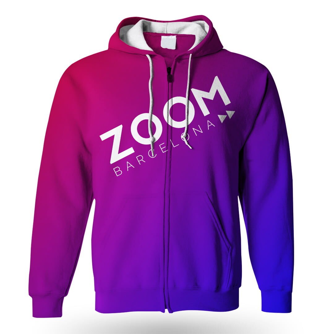
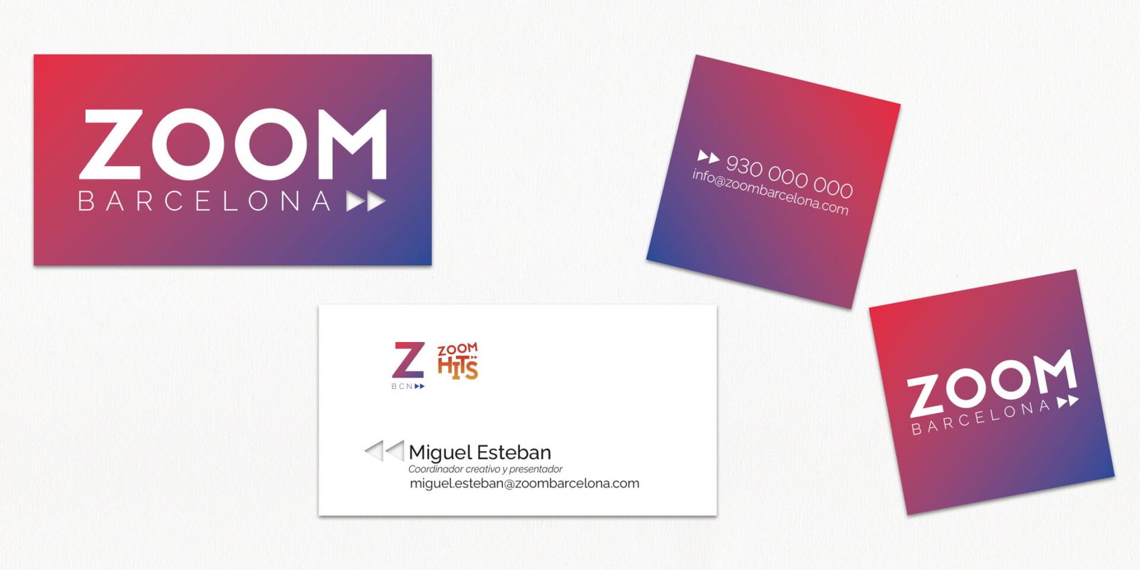
The gradient, a growing tendency, was strategically integrated to connect with the audience of shows like Zoom Hits, reinforcing the digital presence of the brand and adding a contemporary style.
Applications
Their own programs, their own identity
In order to strengthen the visual identity of the channel, there were exclusive logos, animations, and transitions for the shows with larger audiences, creating a more attractive and dynamic visual experience.

24/7 Transmission
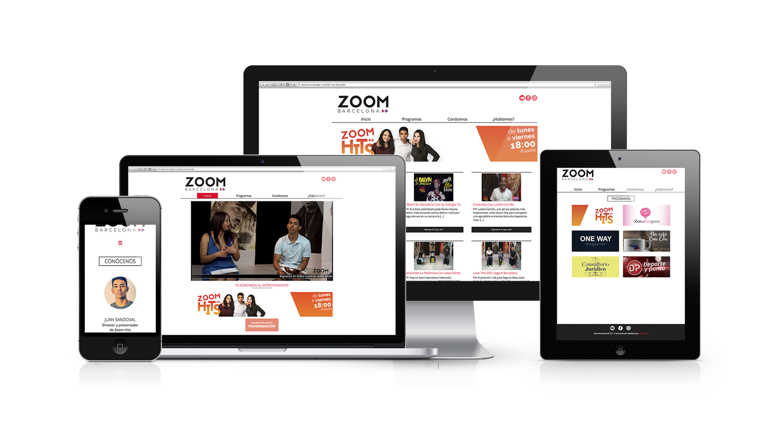
Zoom Barcelona’s website was designed from scratch with a focus on visibility and accessibility. The platform offers a fluid experience with 24/7 live transmission, allowing the users to access unique content and productions at any time.
