Definition
The project began with the need to update their visual identity, as the original logo was generic and lacked personality. A new, more distinctive and versatile brand was created, as well as an alternate proposal that, although it was not the approved version, stood out for its adaptability and visual strength.


Project
Energy, strength, and passion
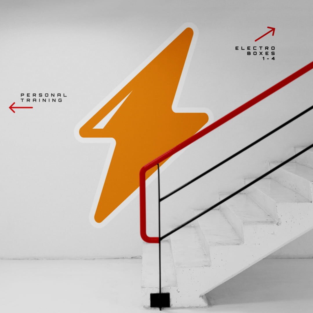
Training is a synonym of explosive energy and dynamism. These concepts translated into a strong design with vibrant colors and a structure that transmitted movement and strength. The graphic identity needed to reflect the high performance and community that Team Body promoted.

Applications
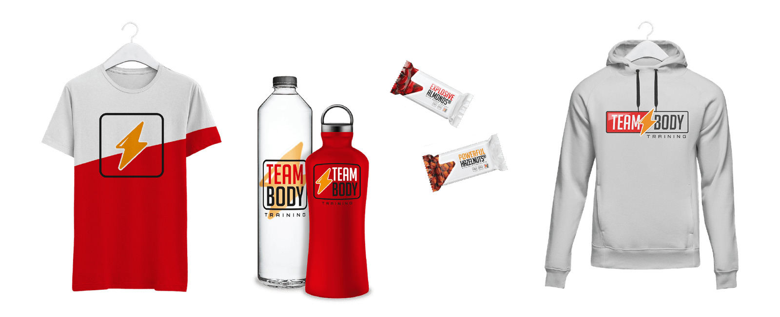
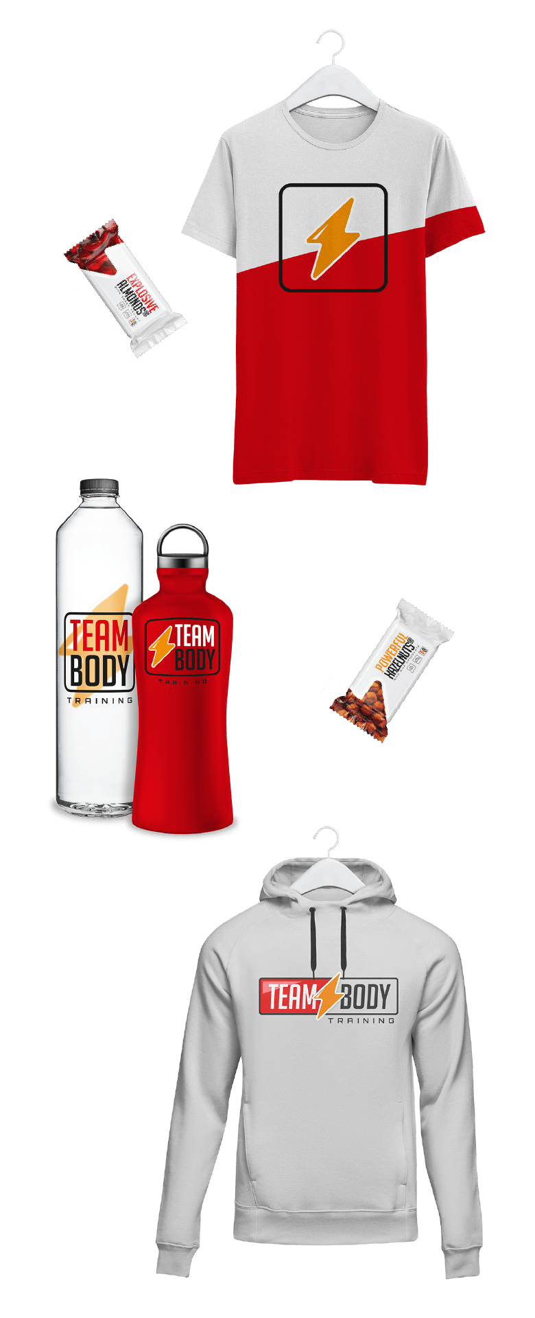
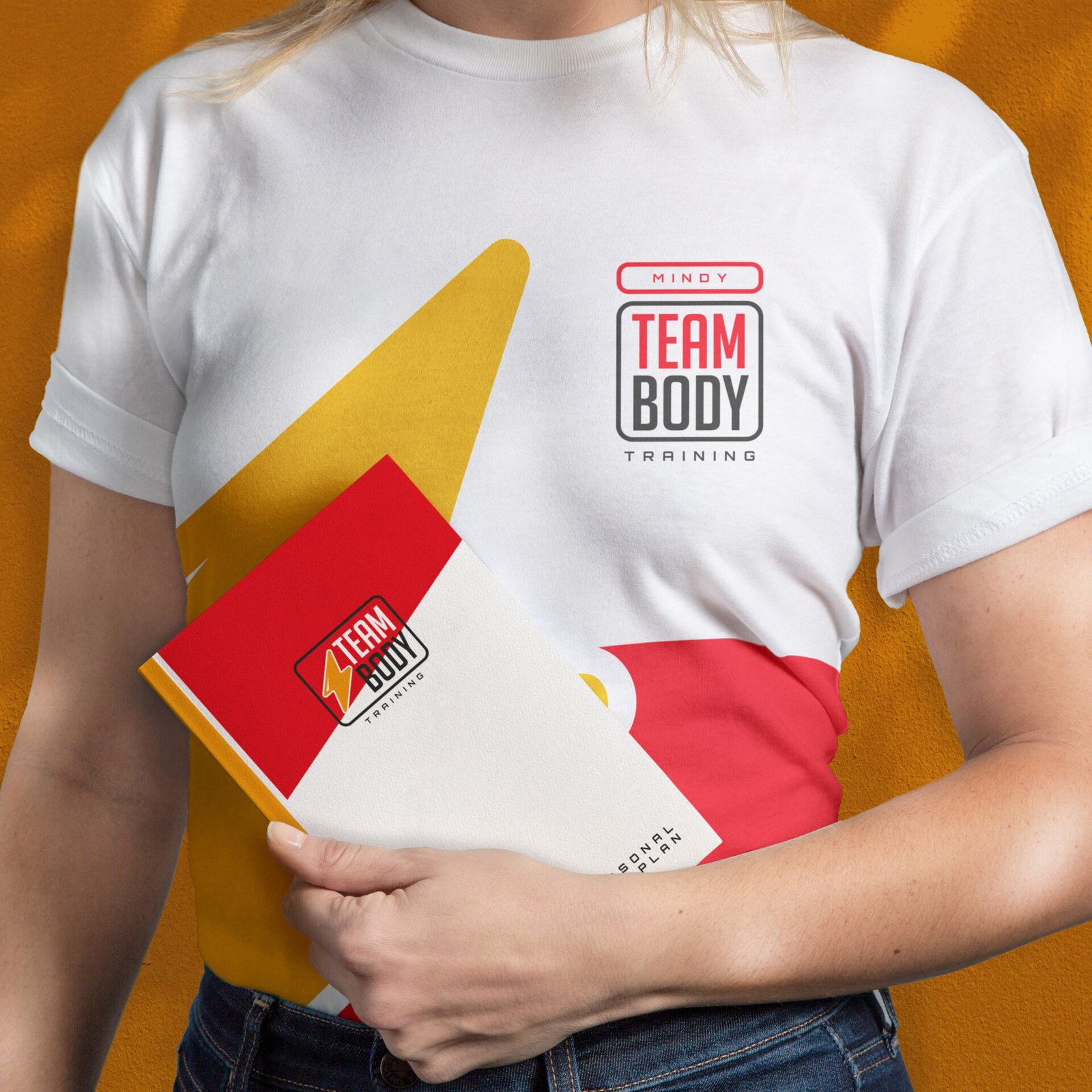
Just like a personalized training, the visual identity required a great flexibility to adapt to different formats. Optimized logo versions were developed to adapt to merchandising, digital communication, and material promotion, maintaining coherence visually and with the spirit of the community that defines Team Body.
