Definition
The name Nexow surges from the combination of Next, now, and Nexo, reflecting a business that breaks with the traditional and bets on innovation. Their visual identity needed to represent this advancement, integrating technology, modernity, and differentiation within the financial sector.

Project
The design of the Nexow brand needed to transmit solidity, trust, and cutting edge approach. Straight lines and robust forms were used to evoke stability and precision, without losing the language of technological advancement.
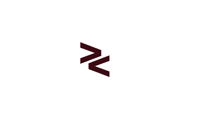
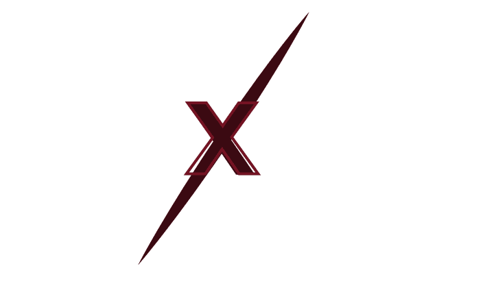
In addition, Nexow sought to be a disruptive and authentic brand, with an aggressive and competitive identity. The “X” became the central concept of the brand:
- Symbolizing union and connection within the markets.
- Representing the rupture of what was conventional.
- Visually, projecting a direct path towards progress.


Applications
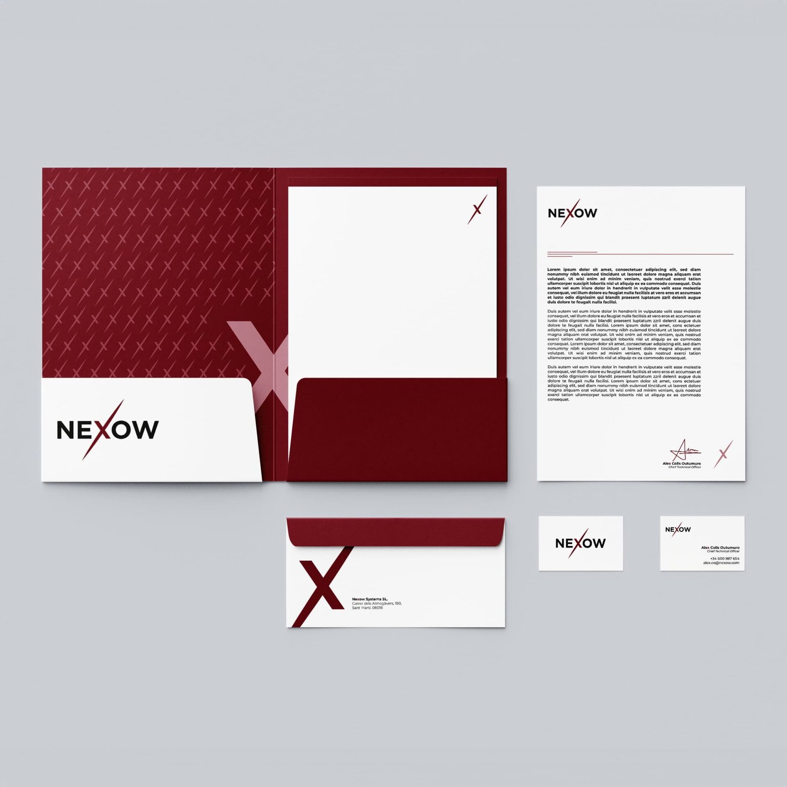
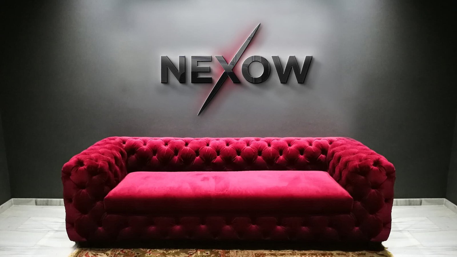
The final logo was implemented in corporate stationary and key spaces within the offices at Nexow, establishing a coherent visual identity, well-aligned with their innovative position.

