Definition
Throughout the years, Network 3.0 evolved into a diverse community of professionals and entrepreneurs. In its relaunch, one of its founders decided to renew the visual identity in order to modernize the brand and strengthen its concept of connection and collaboration.

Project
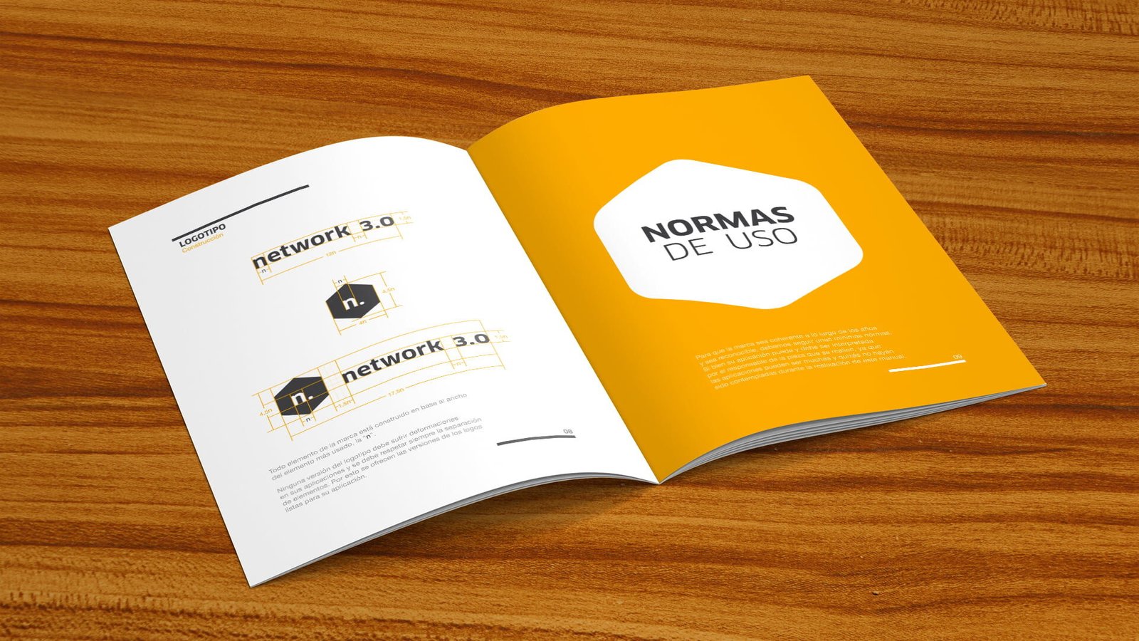
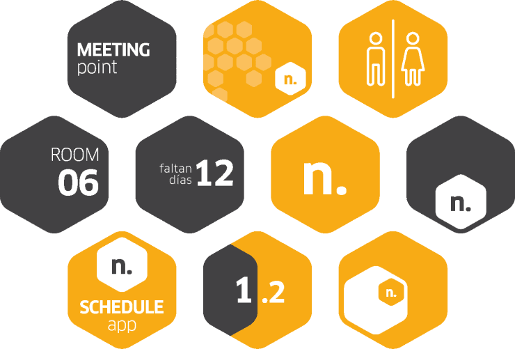
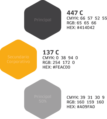
The redesign of the visual identity maintained the essence of the original brand, but it optimized its graphic elements in order to make them more attractive and versatile. Existing resources were explored, like the hexagon, a symbol of unity and teamwork, in order to integrate it in the new corporate image. A new corporate color was also definite and a more solid visual communication was developed.



Applications
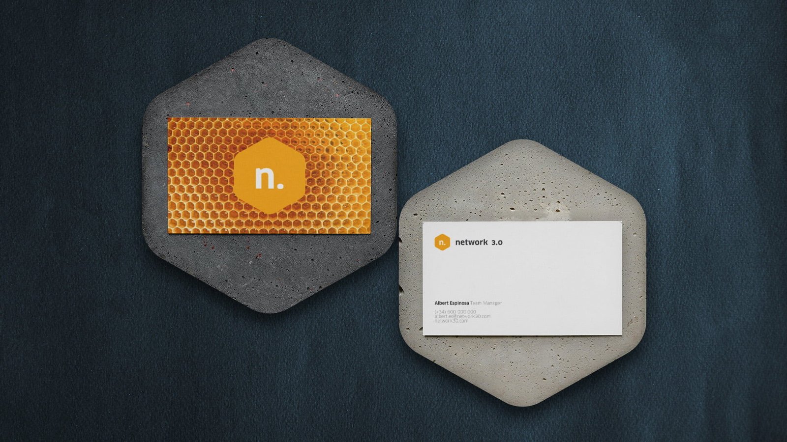
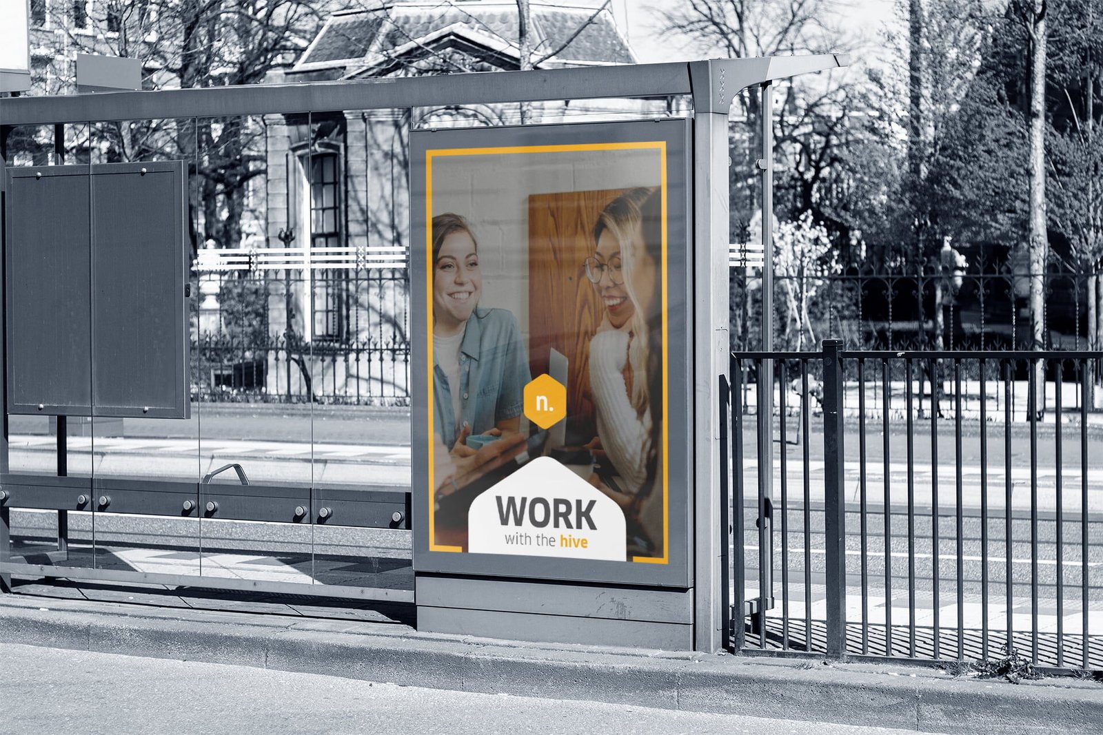
The renewed identity was implemented on business cards, promotional flyers, brochures and postcards, as well as proposals for future applications like signage, icons, corporate stationary, and digital material.
