Definition
This project arose as the creation of a brand identity for a partner with experience in a number of previous businesses, who already knew the quality of our work. The word “Heikin” comes from the Japanese candlesticks, a key tool in the technical analysis of trading, which served as inspiration for the development of a solid and differentiating identity.

Project
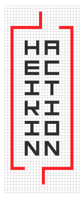
The connection to the oriental culture was a pillar in the logo design, but we avoided the graphic clichés, such as the calligraphy brush-strokes. In order to achieve a balance between tradition and technology, a grid was designed that allowed us to create the symbol, in addition to a personalized typography with an esthetic subtly inspired by the kanjis, without compromising its legibility.
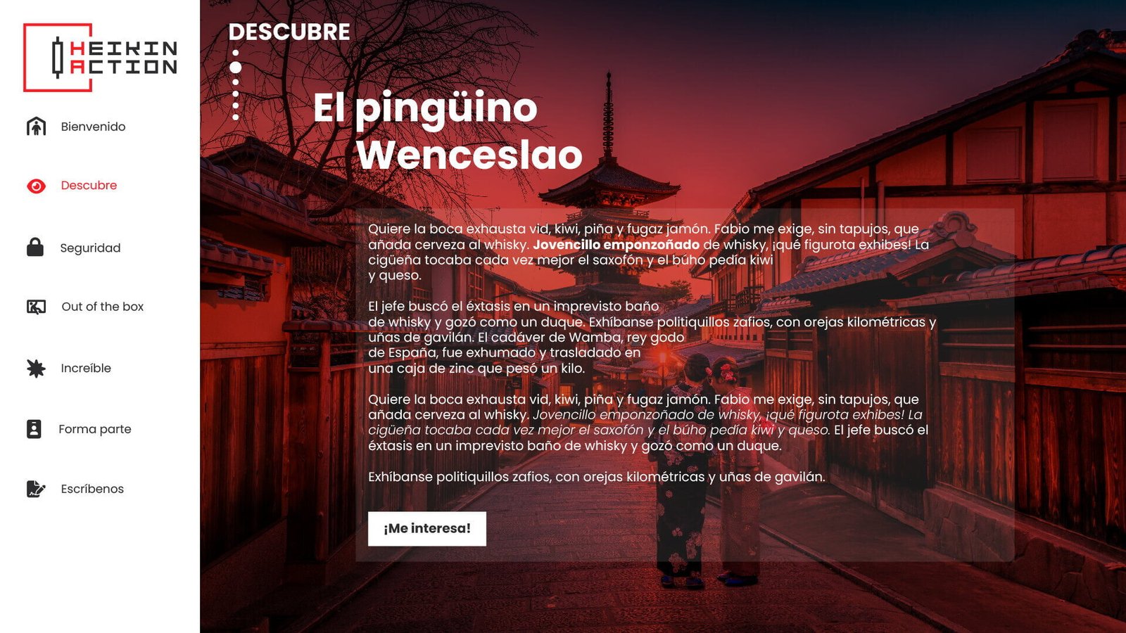
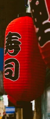
The red color was established as the protagonist of the visual identity, representing energy, action, and strategic decision-making. Its strong association with the Japanese culture strengthens the essence of the project, communicating trust and determination, essential values in the trading world.
The result is a modern and dynamic logo, capable of connecting with its audience and standing out in the financial sector.


Applications
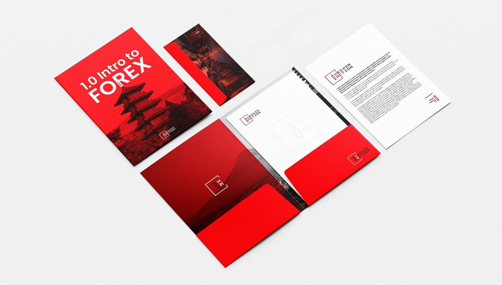
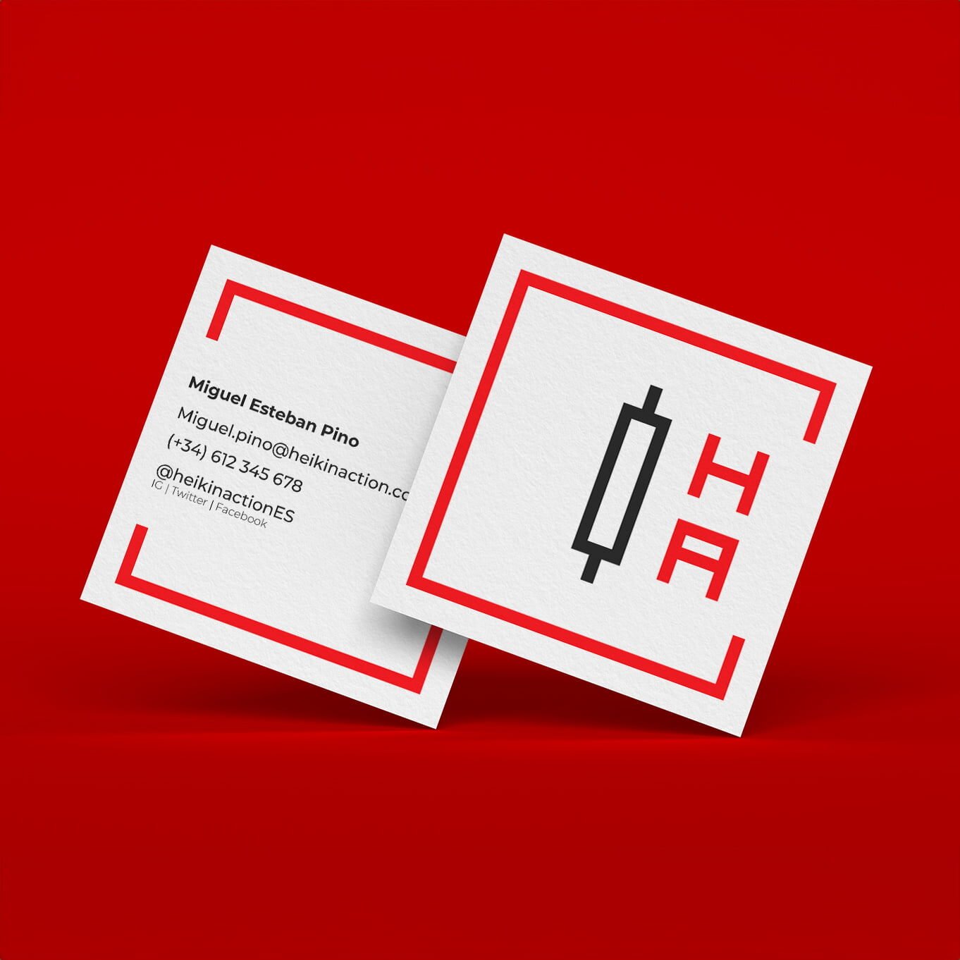
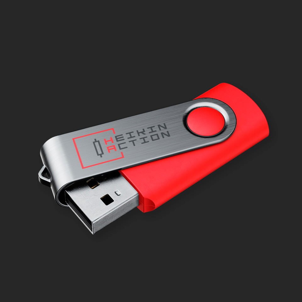
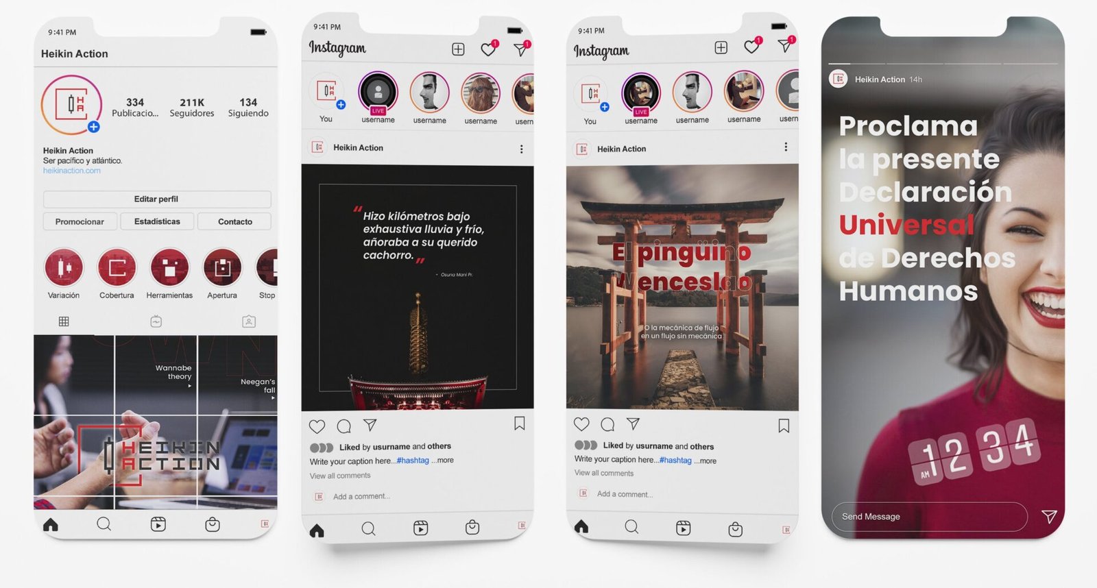
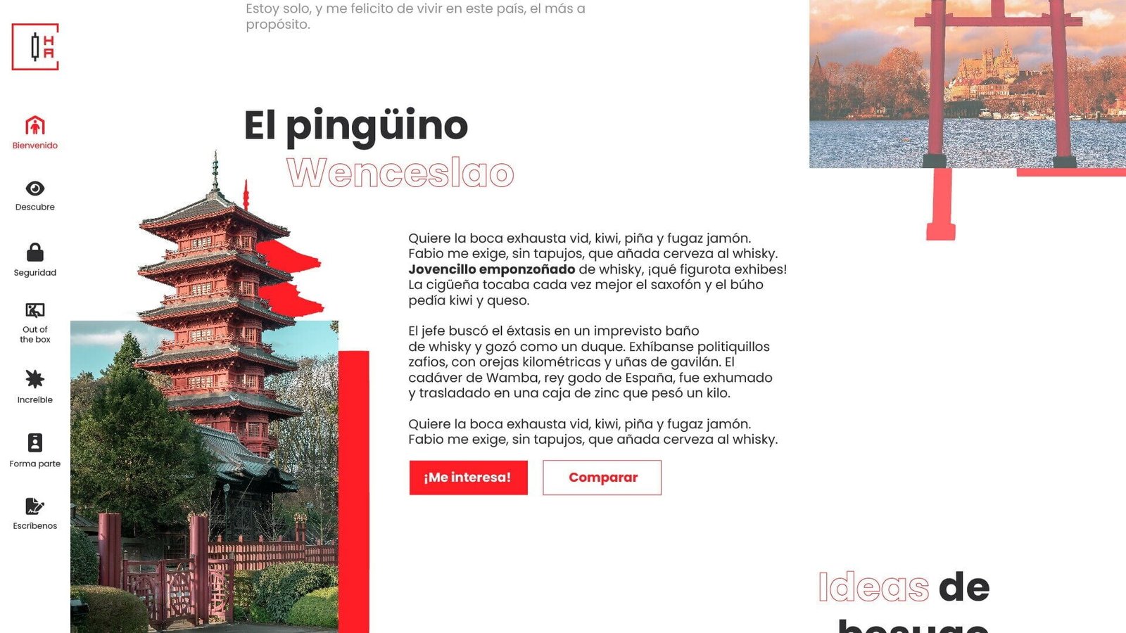
The visual identity of Heikin Action was implemented in corporate stationary, merchandising, and digital platforms, including social media and a proposed website, assuring coherence and easy recognition of the brand through all points of contact.
