Definition
The project started with the logo design for the personal brand “Eagle”. However, as the business grew in partners and objectives, it became necessary to create a more extensive visual identity, including corporate stationary, logo adaptations, and icons for products.

Project
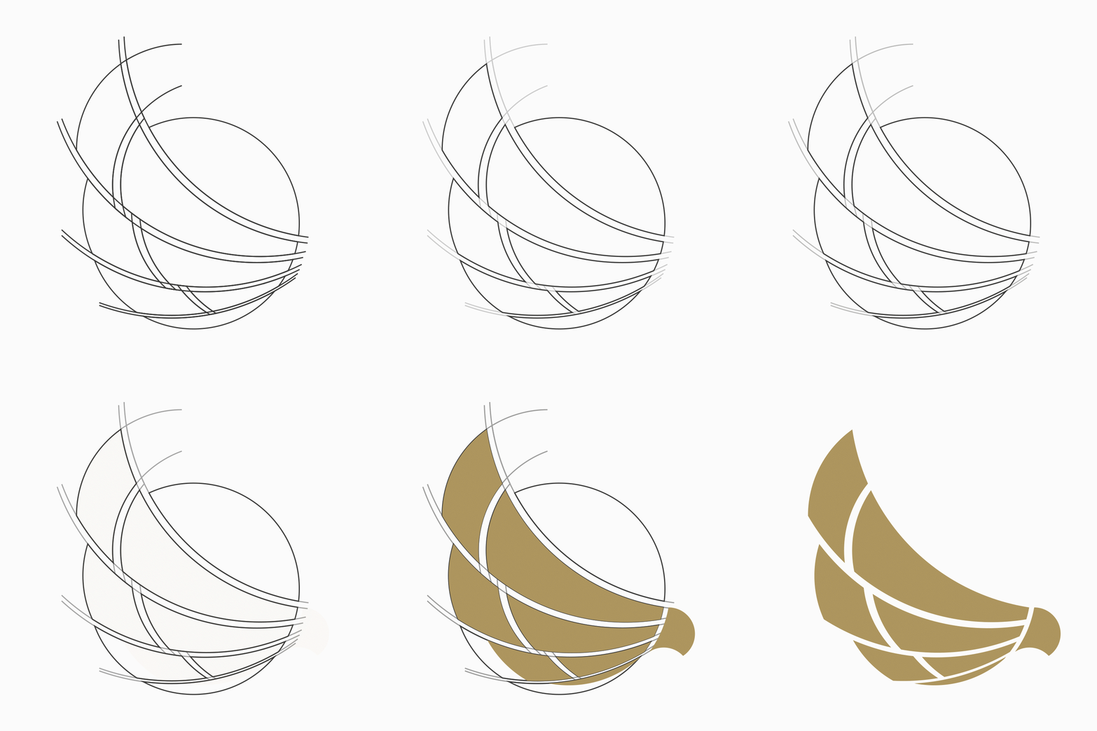
The logo needed to transmit elegance, strength, and focus. Although symmetry was an initial requirement of the client, through the design process they opted for a harmonic and dynamic proposal that reflected movement and a futuristic vision.
With the expansion of the brand, three subdivisions were developed:
- Eagle Group Investments.
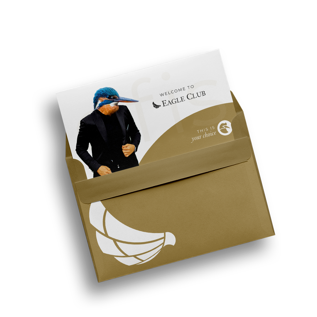
- Eagle Club.
- Eagle Firm
Years later, under new direction, the project grew even more with the creation of logos for seven products, all of which were inspired by birds and designed to be complementary to the principal identity without taking away prominence.

Applications
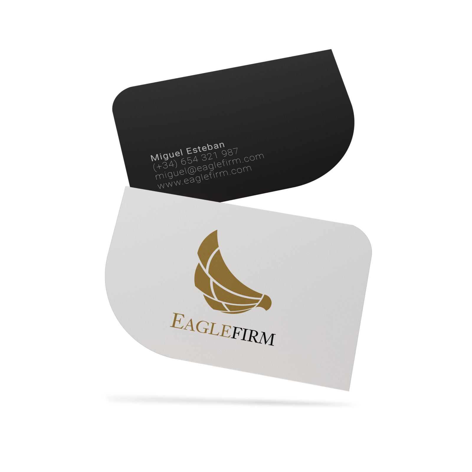
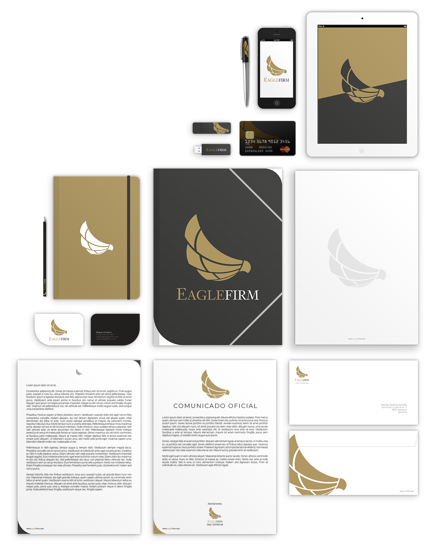
The logo was applied originally in corporate stationery, making the design stand out on business cards. Over time, the visual identity extended to include new graphic resources that reinforced the brand presence in their sector.
