Definition
This project included the creation of the visual identity, corporate materials, and the web design, as well as naming, as the client only had the general idea for the business clear.

Project
The name
The name Deikkon comes from the Indo-European root deck-, which means to indicate or point out. This concept is the base of any translation: to point out the unknown and find the correct term in another language. With this idea in mind, a name was defined that transmitted orientation, clarity, and comprehension, fundamental values of this company.

The symbol
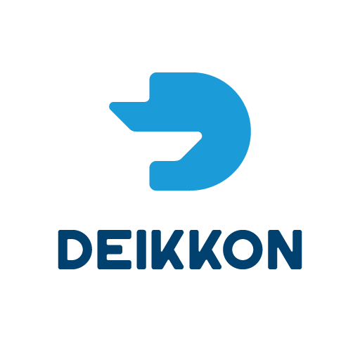
The logo is inspired in the concept of pointing out and guiding. The form of the isotope evokes a pointing hand, while the interaction with the negative space within the “D” reinforces the idea of an interchange of information and knowledge, reflecting the role of Deikkon as a business language translator.


Applications
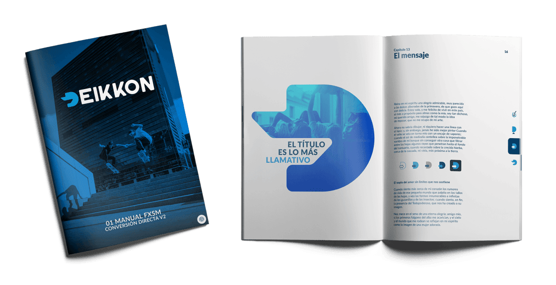
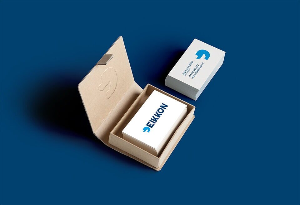
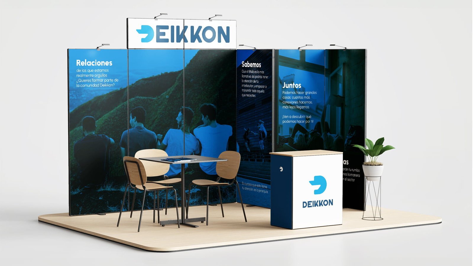
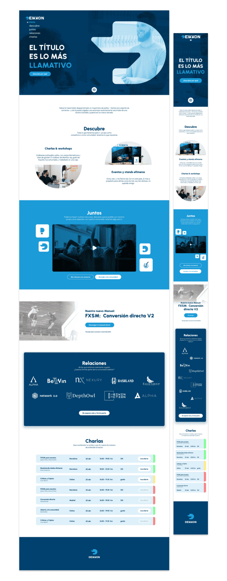
The visual identity was implemented on business cards, corporate documents, and a proposed website, as well as on event stands, ensuring a coherent and professional brand presence.
