Definition
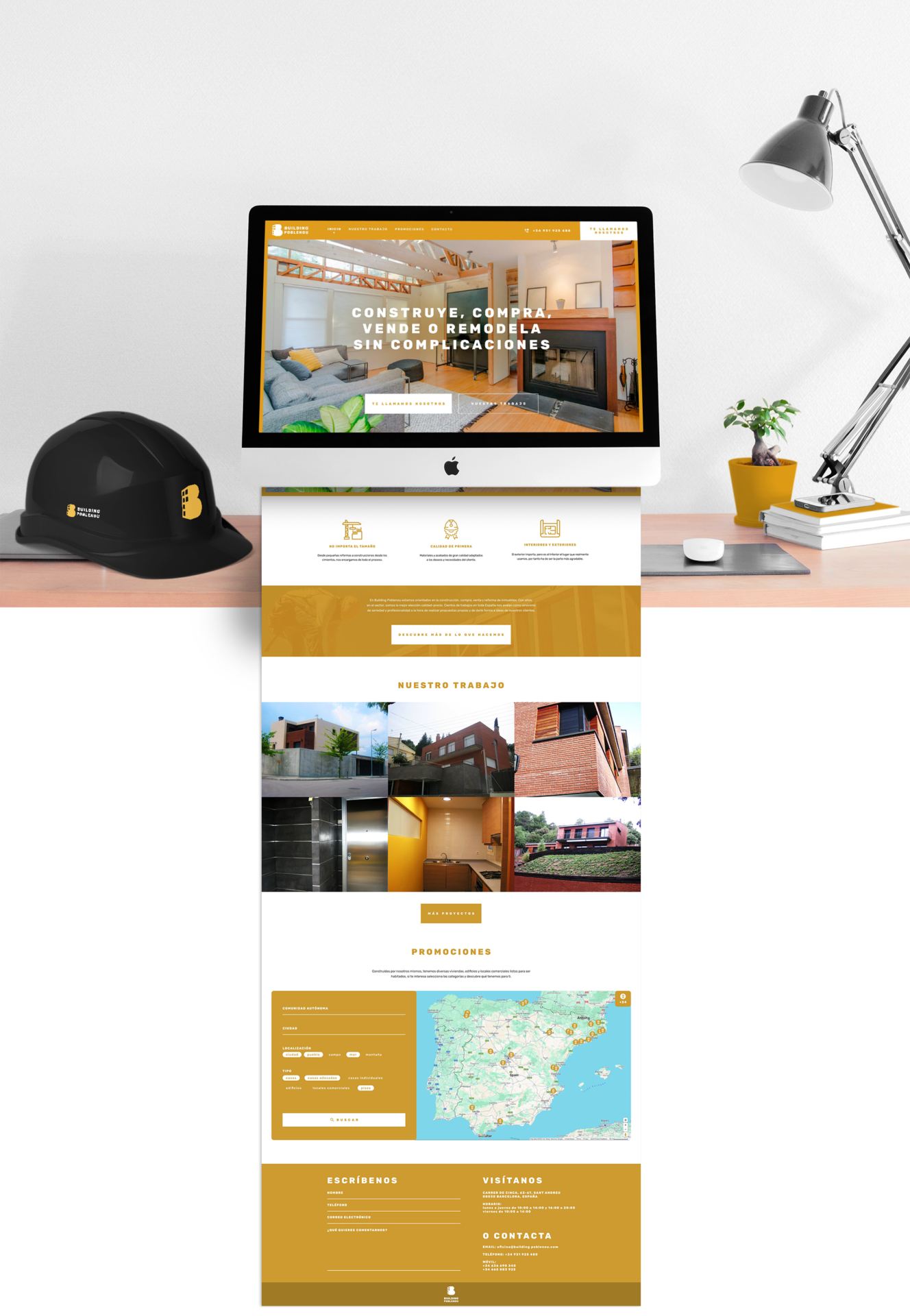
The project encompassed the creation of a solid corporate identity, designed to stand out in physical environments and to strengthen its recognizability. Later, a website proposal was developed to increase its digital presence.
Project
Building Poblenou began as a construction and development business, leaving a tangible mark on the city with hundreds of executed projects. Its visual identity reflects its essence: a brand built on its name, its beginning, and its sector.
The logo is a conceptual representation that can be interpreted as a “B”, a brick, or a building with lighted windows, reinforcing its connection with the construction sector.
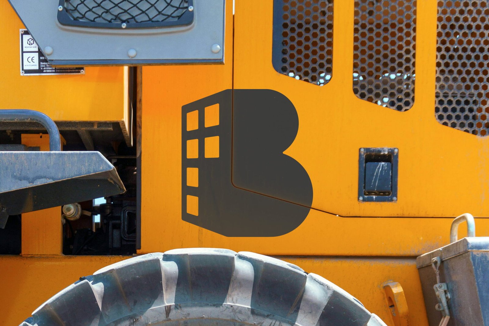
The chromatic palette was strategically chosen to capture attention and to be associated with the dominant colors in machinery, tools, and safety elements within the sector. This decision sought to generate an immediate visual link with the brand, enabling its recognizability on any project in the region.

Applications
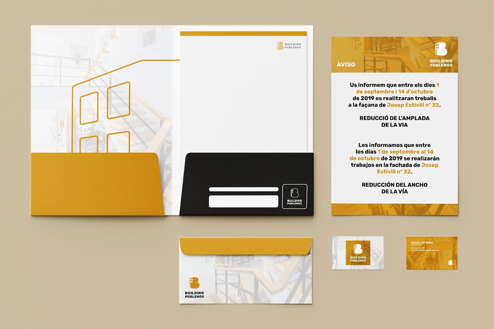
The visual identity of Building Poblenou was implemented on stationery, uniformes, and safety equipment such as hard hats. In addition, a web proposal was developed and applications on machinery were explored.

