Definition
This project sought to define the visual identity of her personal brand, trying to transmit that “aura” that defines her and her way of doing things. Radio shows, events both private and on large scale, concerts, broadcasting cultural events, marketing for businesses and cultural programs with online diffusion are just some of the areas that she has learned to move through with fluidity, always keeping in mind that in each one of them there is a common thread: the message and the connection with the audience.

Project
The shapes
The logo for Aura Sabogal combines elegance and closeness. The personalized typography strengthens her professionalism, while the curves transmite trust and energy, reflecting her capacity to adapt herself to each project.


Color, vitality, and movement
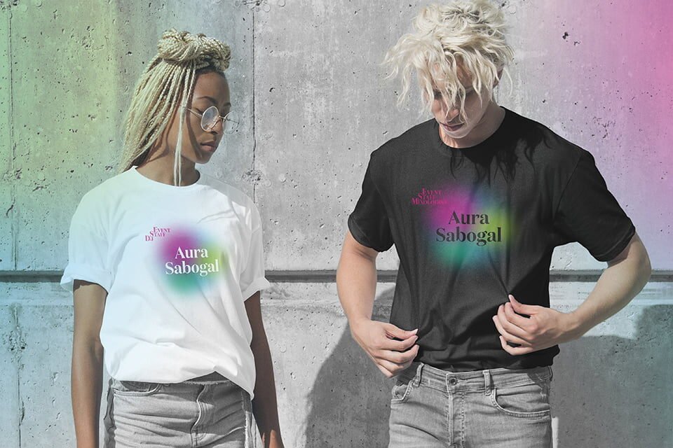
Having the luck of knowing Aura Sabogal as a good friend was essential to be able to define the chromatic palette. Inspired by her energy and her way of working, the color palette evokes the fluidity and the visual impact of the aurora borealis. Her presence in the communication world is dazzling and ever-changing: each new project is a vibrant appearance before submerging herself in the creative process.


Applications
Present in each phase
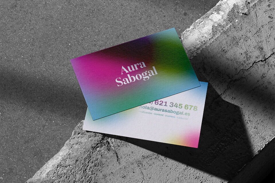
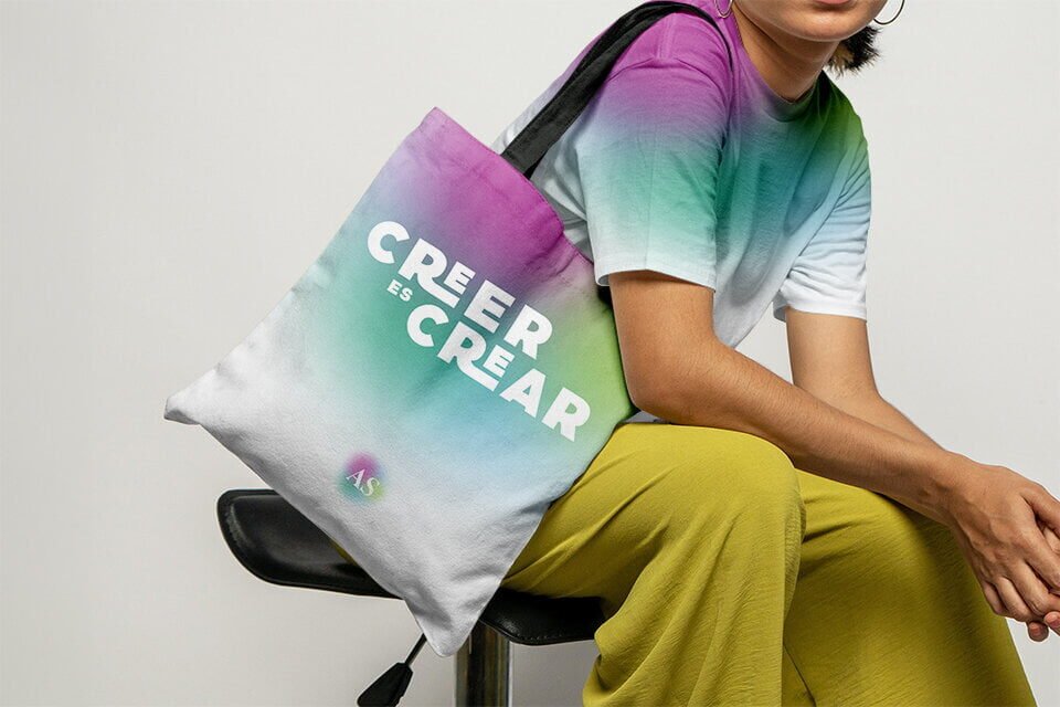
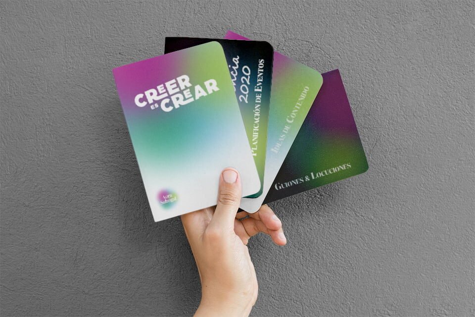
The visual identity of Aura Sabogal is designed to accompany her through the communication process: from the planning and production to the execution and follow up. Her brand not only represents her experience, but also her commitment to each project that she leads.

